 Walk into any coffee shop and you’ll see people on their smart phones, browsing the web, checking email, etc. The fact is, smartphones have become an important part of our daily lives. By the end of this year, there will be 91.4 million mobile internet users.
Here’s some stats that I found online compiled in April 2011 regarding general smartphone use:
- 81% browse the internet
- 77% perform searches
- 68% use an app
- 48% watch videos
- 93% use their smartphones while at home
Here’s some other interesting facts that I wanted to share with you about local searches:
- 9 out of 10 smartphone searches results in an action (purchasing, visiting a business, etc.)
- 88% of these users take action within a day
- 77% contact a business, with 61% calling and 59% visiting the business
Now some facts about purchasers using smartphones:
- 79% use their phones to help with shopping, from comparing prices, finding more product info to locating a business
- 74% make a purchase
The only conclusion I come to from these findings is that businesses have to make sure that when they are found via mobile searches, the consumers can view your website content easily and take actions (view inventory, call, email, locate your business, etc.).
What is a “mobile enabled” website?
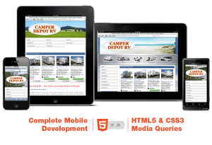
A true “mobile enabled” website will automatically detect what environment each visitor is using to access your website, then display it in the format best for that device. That could be an iPhone, iPad, Blackberry, Andriod, etc. A traditional website, that’s not mobile enabled, when accessed using a smart phone is very difficult to read unless you zoom in several times and then you have to scroll left to right to see all the content on the page. With a mobile enabled website, the navigation and content is reorganized so that it fits the browser window for the device used, and the pages are made “lighter” so they download quickly.
To see the difference between the two, go to your browser on your smart phone.
For a non-mobile enabled example, go to: https://www.netsourcervs.com/
For a mobile enabled example, go to: https://www.whitespruce.com/
Why do you need a mobile enabled website?
I believe the stats above answers that question for you. I would think no one is more “mobile” than an RVer, so as more and more of your target audience use smartphones, you’re going to want your website, which is an extension of your company, to be ready to serve them up with a custom, mobile browsing experience.
For more information and to see our mobile demo, go to: https://mobiledemo.netsourcervs.com/
Here’s some updated information on mobile website traffic for 2012 and 2013.
Cindy Spencer 🙂
 Cindy Spencer, an Account Manager at NetSource Media since 2000, works with clients across the US with RVUSA.com, TrailersUSA.com and RVCanada.com. Cindy and her in-house team of designers and programmers helps dealers with website design & hosting, inventory management & distribution, website maintenance & SEO and much more. Connect with Cindy on Google+.

